If you've ever picked up a book just because the cover caught your eye, there's a good chance Chip Kidd had something to do with it.


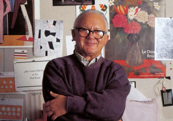
Chip Kidd is one of my all-time favorite graphic designers. His name might not be instantly recognizable to everyone, but his work almost certainly is. He has spent decades transforming how we experience books, not just through layout and typography but through bold and intentional covers that instantly grab attention. His long career at Alfred A. Knopf allowed him to explore a wide range of visual styles, each one tailored to the book it represents. For Kidd, the cover is not just packaging. It is the opening line.
He once said, “A book cover is a haiku of the story,” and that line has stuck with me ever since. Kidd’s covers are more than clever visuals. They are emotional cues that help shape the reading experience before a single page is turned. That kind of depth and restraint is something I strive for in my own work.
When it comes to iconic book covers, Kidd’s work on Jurassic Park stands in a league of its own. The black and white T Rex skeleton he designed is clean, powerful, and unforgettable. That one image helped define the look of the bestselling book, but it also crossed over into the movie world, becoming the foundation for the film’s entire visual identity. To this day, that dinosaur logo is instantly recognizable across the globe. And it all started with a book cover.

One thing I deeply admire about Chip Kidd is that he refuses to stick to a formula. He doesn’t have one fixed style, and that makes his work endlessly interesting. His cover for The Secret History is restrained and elegant, while 1Q84 is strange, fragmented, and layered. Each design feels like it could only belong to that book. That kind of creative flexibility is rare and inspiring. It reminds me that good design serves the story and that each project deserves its own voice.
“A book cover is a distillation. It is a haiku of the story.” — Chip Kidd
Kidd’s work proves that a book cover can be more than a marketing tool. It can be an entry point, a tone setter, even an emotional anchor. Whether he uses photography, hand-drawn elements, bold typography, or collage, the goal remains the same. He wants the reader to feel something. And in a world where attention is short and first impressions matter, that kind of thoughtful storytelling through design is more relevant than ever.

Chip Kidd has shaped the way I look at design. His ability to blend intelligence, humor, and emotion into a single image continues to influence how I approach my work. He shows that great design doesn’t need to shout. It just needs to speak clearly and honestly. Whether you are a designer, a reader, or someone who just loves a great visual, Kidd’s work is a masterclass in what it means to communicate with purpose.